The Aware dashboard is the primary interface to get district-level and student-level information about student wellness. It enables proactive intervention by providing administrators with insights into students requiring immediate attention.
Staff members in Faculty Groups can also use the Aware dashboard, but they will only see information about students in their assigned OUs or Security Groups. This is done to protect student data privacy and make sure staff aren't overwhelmed with too much data.
Using the Aware Dashboard
The Aware Dashboard provides student wellness data across your whole school, categorizing students into wellness levels based on their online activity. Wellness levels are Aware’s interpretation of a student’s current level of emotional well-being. There are four different levels of categorization based on severity:
- Critical students
- High risk students
- Concerning students
- All Clear
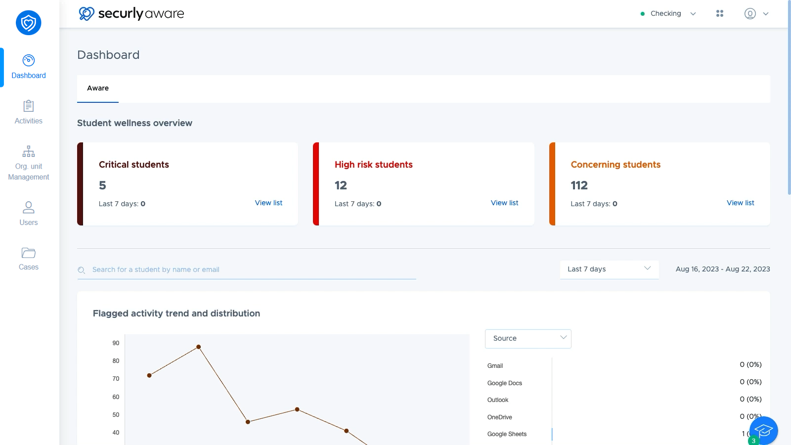
At the top of the dashboard under the Student wellness overview section which contains three widgets showing you how many students are in the Critical, High risk, and Concerning levels. Refer to this knowledge base article to learn more about Wellness levels.
Viewing per-student information on the Aware Dashboard
When you click "View list" on one of the wellness level cards at the top, the dashboard brings up a list of students in the wellness level.
From here, you can not only see their email ID and org. unit, but also also the changes in student Wellness Levels with visual indicators for how many levels they moved, as well as the time they’ve been at their current Wellness Level.
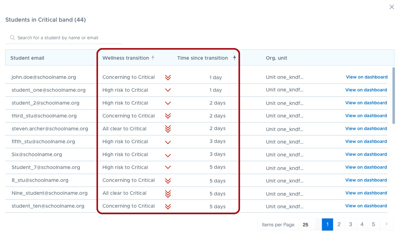
Each arrow represents a jump of one wellness level. Multiple arrows indicate a jump of more than one level. Red, downward arrows show negative changes in wellness. Green, upward arrows show positive changes in wellness. For example, if a student moves from All Clear to Critical, Aware will show three red downward arrows to highlight a significant negative change. If a student moves from Critical to High Risk, Aware will show a single green upward arrow to indicate a positive step.
Clicking "View on dashboard" narrows the data shown on the Aware dashboard to just that one student. This helps you review that student's flagged searches and site visits, and understand the factors that contributed to the decline in their wellness level.
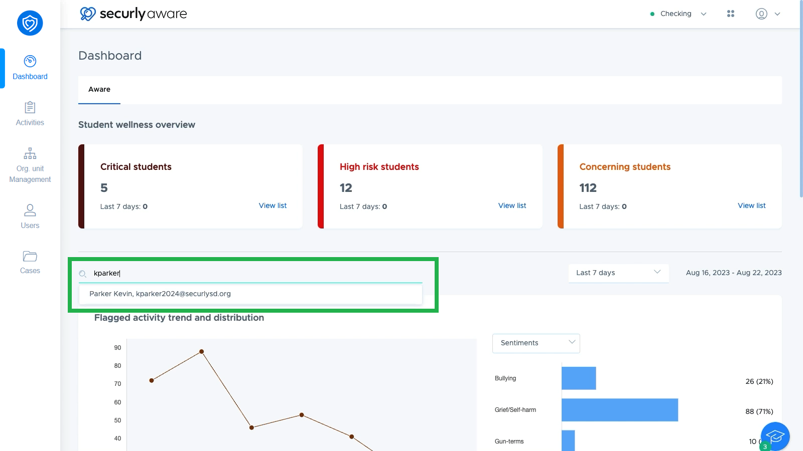
If you want to find a particular student, you can search for them by name or email using the search bar just below the student wellness overview section.
Data available on the Aware Dashboard
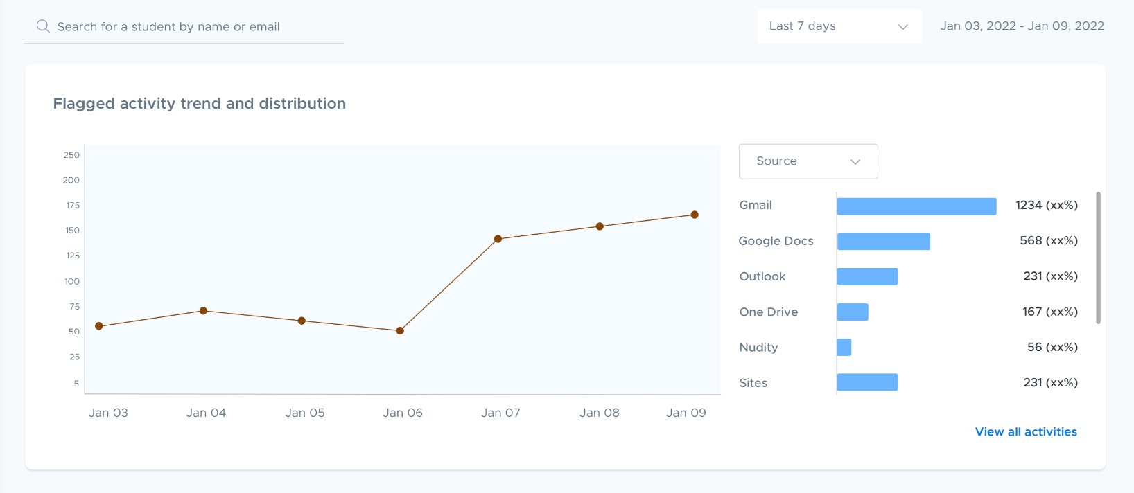
Further down the dashboard, some high-level information is displayed in graphs. The dashboard displays the past week’s activity by default, but you change the time frame with the selector in the upper right.
In the Flagged activity trend and distribution section, you can see data on your school's flagged activity broken down by source or category. This can help you analyze student wellness over time, and allow you to understand where to focus your student wellness efforts, such as anti-bullying and anti-self-harm programs.
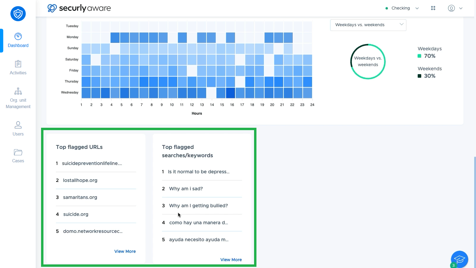
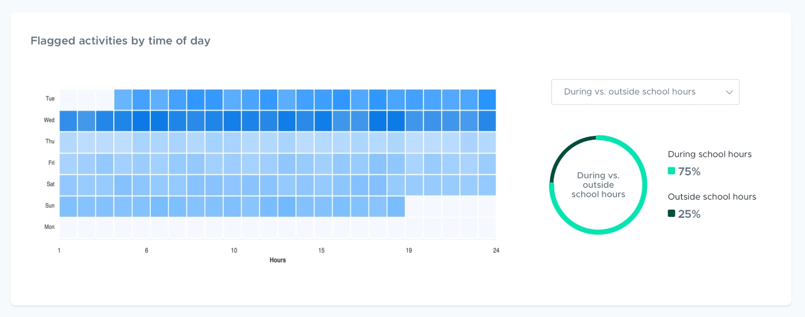
You will also find a breakdown of flagged activity by day and time of day, as well as a chart showing flagged activity during vs. after school hours, or weekday vs. weekend. This makes it easy to see patterns and see when students are most in need of help.
At the bottom of the dashboard, you'll see Top flagged URLs and Top flagged searches/keywords.